jQuery/Web Development Advanced
Section 2
jQuery Review
What code should you always wrap your jQuery in?
$(document).ready(function(event){
  // jQuery code goes in here
});
Updating CSS Styles with jQuery
The .css() method can handle any CSS changes in jQuery.
$('h1').css('font-size', '30px');

$('#header').css({
	height: '300px',
	background: '#333'
});
The first line of code above shows you how to update a single CSS property, in this case we're updating the h1 tag and changing the font-size to 30px.
The second section shows you how to update multiple CSS properties at once.
Enough Talk: Let's Code!
Using the .css() method, update the CSS of an element.
Onclick Function
One of the most commonly used events is the click event. The click event is a method that gets triggered whenever someone clicks on the HTML element that is declared at the beginning of the click event method.
HTML:
<button>Click here to reveal the text</button>
<p class="superhero-weakness">
Your secret text here
</p>

CSS:
.superhero-weakness {
    display: none;
}
Add the above code to your HTML
Adding the Onclick Event
In the below jQuery, we are creating an event that will go off whenever someone clicks on a button HTML element.
$('button').click(function(event){
  $('.superhero-weakness').css('display', 'block');
});
When they click on it, this method will go after the element with a CLASS of superhero-weakness and change it from display none to block.
Enough Talk: Let's Code!
Use the button click event to change the text color of an HTML element.

Let's create a menu!
Go to http://www.bizstreamacademy.com and go to the Resources page.
At the bottom of the page, right click on the about.html and contact.html and choose 'Save link as...' in the dropdown. Then navigate to and save to your project folder.
Save those 2 files to your project folder.
Menu HTML
Add the following HTML inside or below your header HTML:
<nav id="menu">
    <ul>
        <li>
            <a href="index.html">Home</a>
        </li>
        <li>
            <a href="about.html">About</a>
        </li>
        <li>
            <a href="contact.html">Contact</a>
        </li>
    </ul>
</nav>
The above code is the basic structure for most website menus. It utilizes the unordered list HTML and wraps it in a nav HTML5 tag.
Let's style that menu!
#menu {
    float: right;
}

#menu ul {
    list-style: none;
    margin: 0;
    padding: 0;
}

#menu ul li {
    float: left;
}

#menu ul li a {
    display: block;
    font-size: 20px;
    padding-left: 35px;
    line-height: 65px;
}
Our above CSS does 2 main things. First, it takes away the 'list' formatting that comes with an unordered list HTML element. Then it takes the li's and 'floats' them to the left (so they're all next to each other).
Enough Talk: Let's Code!
Take the next 5 minutes to work on your about or contact page. Or ask us any questions about how to edit the menu!
What is a Media Query?
A media query is a way of specifying certain CSS at different screen widths.
@media only screen and (max-width: 750px) {
    body {
        background-color: blue;
    }
}
The above code states "If the browser/device window is smaller than 750px, then the background color will change to blue."
Creating a mobile style sheet
To keep things simple, we'll be separating out our mobile styles in a new stylesheet.
In your HTML head, below where your style.css is declared, paste in this HTML:
<link href="mobile.css" type="text/css" rel="stylesheet">
Then create a new file called mobile.css in your project folder.
Adding a mobile meta tag
In your HTML head, preferably at the top, but it can go anywhere in your head section.
We need this meta tag to optimize your website for mobile devices.
<meta name="viewport" content="width=device-width, initial-scale=1">
Adding mobile styles
In your newly created mobile.css file, add the following css:
@media only screen and (max-width: 750px) {
    body {
        background-color: blue;
    }
}
Resize your browser to see how your background color changes on a small screen.
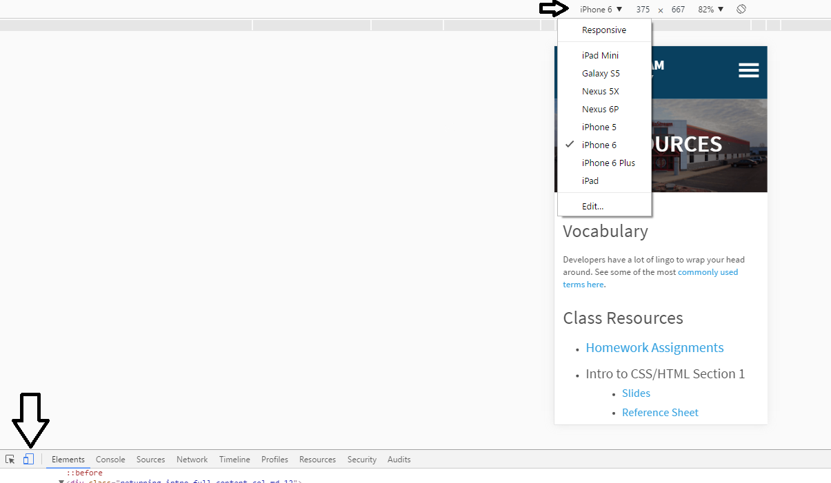
Testing on "mobile" device
Changing Menu Styles on Mobile
Inside your mobile.css file, add the following CSS:
#menu ul li {
    float: none;
}

#menu ul li a {
    padding: 0;
    line-height: 30px;
    text-align: right;
}
We're adding this CSS because we want the menu items to appear 'stacked' in our mobile view and not all right next to each other.
What's a hamburger menu?
A hamburger menu is simply 3 bars in a row from top to bottom. It is an icon that has become known to show a site's menu when you click on it.

Download your hamburger menu icon
Go to http://www.bizstreamacademy.com and go to the Resources page.
At the bottom of the page, right click on the menu-icon-white.png OR menu-icon-black.png. If you have a dark colored background, choose white, otherwise choose black. Then from the dropdown chooose "Save link as..." and navigate to your project folder.
Hamburger menu HTML
Add the following code to your HTML, above your menu HTML
<div class="toggle-menu">
    <img src="menu-icon-white.png" />
</div>
The img tag here is your hamburger menu you downloaded. Then we wrap that in a div with a class of toggle-menu. We'll use that class in a minute to active our mobile menu.
Hamburger menu only on mobile?
Right now the hamburger menu is always there, but we really only want to see it on mobile.
Add the following CSS to your style.css file.
.toggle-menu {
    display: none;
}
Active menu icon and hide menu
Now that the mobile menu icon is hidden on desktop, we need to display it on mobile and hide the menu itself.
Add the following CSS to your mobile.css file:
.toggle-menu {
    display: block;
    float: right;
    margin-top: 30px;
}

#menu {
    display: none;
}
Desktop = menu shows, hamburger menu icon hidden
Mobile = menu hidden, hamburger menu icon shows
But the icon does nothing?
If only we had a way to do SOMETHING to get the menu to appear?!
Any guesses?

Toggling the Menu
The following code will execute when you click on the div with class toggle-menu. Then it will toggle the menu on and off.
$('.toggle-menu').click(function() {
    $('#menu').slideToggle();
});
The slideToggle command in jQuery is used to turn the display of an HTML element on and off.
Enough Talk: Let's Code!
Want to style your mobile menu more? Or style something else for your mobile view? Maybe change a column width to 100%?
Questions?