Intermediate CSS
Quiz Part 1
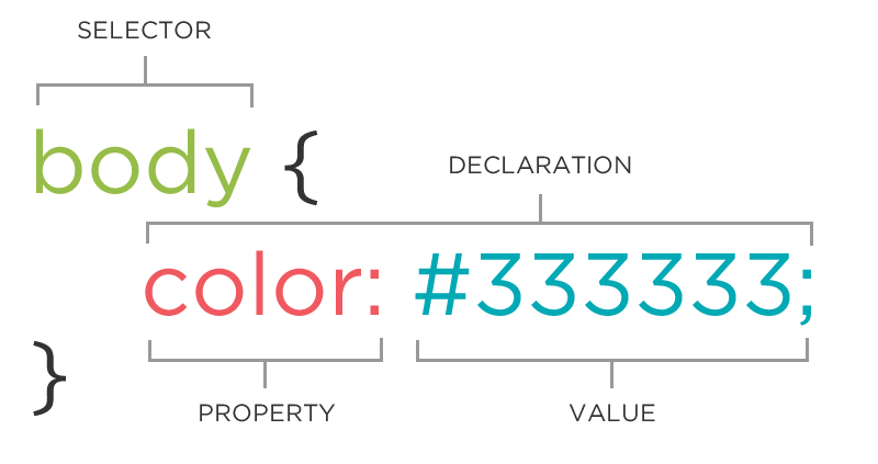
What are the three parts that make up The CSS Rule?
Quiz Part 2
How would you style a paragraph and a footer to have blue text?
p, footer {
  color: blue;
}
Quiz Part 3
                my-class {
                  font-color: red
                }

                my-class {
                  size: 14pxs
                }
                .my-class {
                  color: red;
                  font-size: 14px;
                }
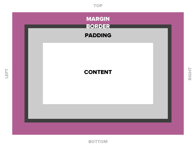
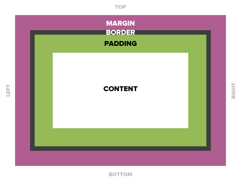
The Box Model
Box Model
All HTML elements can be considered as boxes. In CSS, the term "box model" is used when talking about design and layout.
The CSS box model is essentially a box that wraps around every HTML element. It consists of: margins, borders, padding, and the actual content.
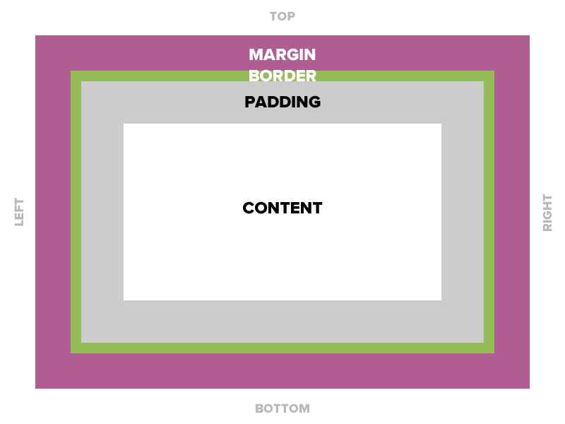
Padding
Space between the border and the content
Padding
Notice that the padding adds to the total width of the box.
Padding
15 pixels on all sides
padding: 15px;10 pixels on top only
padding-top: 10px;10 on top, 5 on right, 3 on bottom, 5 on left
padding: 10px 5px 3px 5px;Padding
Four values
padding: top right bottom left;Three values
padding: top right/left bottom;Two values
padding: top/bottom right/left;One value
padding: all;Padding
padding: 10px 20px 30px 40px;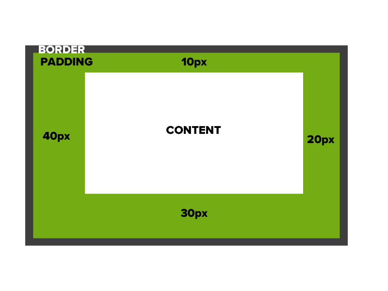
Enough Talk: Let's Code!
Try adding some padding to the div with the class that has your main content.
Remember: you can write out "padding-left", "padding-right", etc. or you can use shorthand declarations.
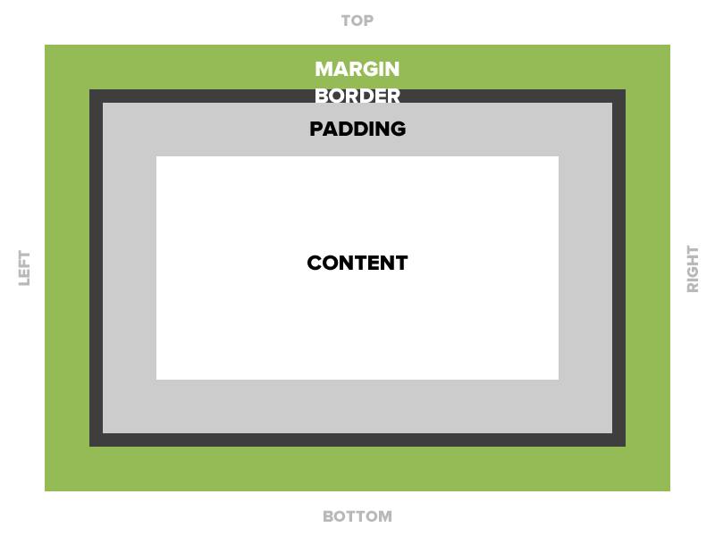
Border
The edge around the box.
Border
Borders are specified as "thickness, style, color."
A solid red border
border: 1px solid #ff0000;A thick dotted black top border
border-top: 4px dotted #000000;Two different border styles
border-top: 1px solid #ff0000;
border-bottom: 4px dotted #000000;
Border - Other Properties
border-width: 10px;
border-style: dashed;
border-color: #666666;
You can specify each property separately, or all three together.
Enough Talk: Let's Code!
Try adding a border to your <header> element as well as some padding.
Experiment with different border styles, thicknesses, and positions.
Margin
The transparent area around the box that separates it from other elements by creating whitespace. It can be used to horizontally center an element as well.
Margin
15 pixels on all sides
margin: 15px;10 on top, 5 on right, 3 on bottom, 5 on left
margin: 10px 5px 3px 5px;10 pixels on top
margin-top: 10px;Auto Margin
If a margin is set to auto on a box that has width, it will take up as much space as possible.
CENTERED
margin: 0 auto;
width: 200px;
This box will be centered.
Wrappers
Wrappers are a good way to center content if the screen width is wider than your content.
.wrapper {
  width: 100%;
  max-width: 1200px;
  margin: 0 auto;
}
Enough Talk: Let's Code!
Try adding some margin to your <footer> element.
Notice how margin pushes the footer away from other content but the element stays the same size;
Then center your entire document in the browser by adding a wrapper class with auto margin, width and a max-width.
Placing elements side by side
If you want two block level elements to be side by side, you need to float both elements..
width: 25%;
float: left;
width: 75%;
float: left;
Float
- "Floating" an element takes it in the normal flow, as far to the left or right of it's containing element as possible.
- Any other elements, such as paragraphs or lists, will wrap around the floated element.
- Always specify a width when floating an element, otherwise the element is likely to take up the whole page and not appear floated.
- You can specify a) whether an element is floated or not, and b) which side it floats on.
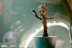
This is a long paragraph text that is next to an image that is floating to the left. This is an image of Baby Groot. Groot was a Flora colossus from Planet X, the capital of the branch worlds. The sapling that would come to be known as "Groot" came from an "Enobled Sap-line" and gifted in quasi-dimensional super-positional engineering...at least, according to Maximus the Mad. Groot did not get along with his fellow saplings, instead preferring the company of the "Maintenance Mammals" who the other saplings treated with prejudice. After Groot killed another sapling to defend a maintenance mammal it was brutalising, as well as releasing a human subject that was kidnapped for scientific purposes, he was exiled of the planet by the "Arbor Masters". With no place to go, Groot set to explore other galaxies.
Clear
- Clearing tells the element on which side (right, left, both) other elements cannot appear.
- If you had an image floated left, and you did not want the paragraph to appear next to it, you would add clear: left; to the paragraph.
- Clearing both sides makes sure floats don’t flow past the clear element.
clear: right;
clear: left;
clear: both;
Clearfix
A clearfix is applied to pseudo-class :after of a div that contains two elements that are floating next to each other.
It's generally used in float layouts where elements are floated to be stacked horizontally.
Clearfix CSS
.wrapper:after {
    content: '';
    display: table;
    clear:  both;
}
Be sure to apply this to the div that is containing your two elements that are floating next to each other.
Enough Talk, Lets Code!
Add a clearfix to your wrapper div or any other elements that you want to stop floating.
Questions?